- Welcome
- TeamWox Communicator
- Diagrams
- Editor
- Templates
- User Details
- Getting Started
- Browser Settings
- Calendar
- Calls
- Charts
- Exit
- File Viewers
- Filters
- Notifications
- Certificate Installation
- Interface
- List of Assigned
- Mind Map
- Permissions
- Search
- Status
- Google Translate
- Windows
- Home
- Tasks
- Documents
- Service Desk
- Chat
- Organizations
- Contacts
- Board
- Team
- Products
- Accounting
- E-Bank
- Search
- Calendar
- Telephony
- Administration
- Projects
Charts
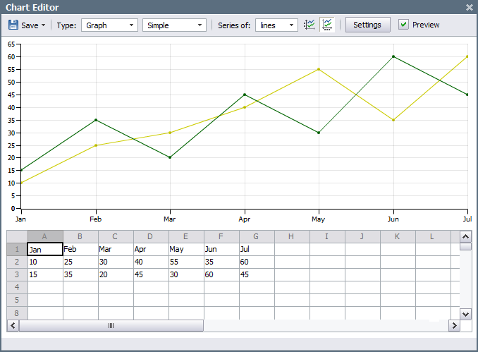
The feature of creating different diagrams and attaching them to the messages is implemented in the TeamWox system. In order to create a chart you should press the  button located in the lower part of message editor. The window of chart editor will be opened as soon as you do it:
Upper Menu
Using the upper menu, one can manage the main settings of a chart:
 Save — save the chart under a specified name. If you press the down arrow, the extended menu will appear. Using it, one can export the chart to Microsoft Excel 2007 or save it as an image in the PNG format. There is also the "Import from CSV" command that allows to import data for drawing a chart from the corresponding files.
Only the export of charts to Microsoft Excel 2007 is implemented, other versions are not supported. |
- Type — in these fields one can choose the type of chart and the type of its drawing.
- Series of — in this field you can specify which data (lines or columns) will be used to draw the series. If you choose lines, then the first line of the data block will be taken as a horizontal scale, in case of choosing the columns, the first column will be used.
 — use the first value of the series as a header. If you enable this option, then the first value of the series in the column or line (depending on the series building setting) will be used as the name of series. You can see the name of the series if you put the mouse cursor over it on the chart. The pop-up help that displays the name and the value in the nearest point will appear.
 — convert the first series into horizontal axis headers. The first column or line (depending on the series building setting) can be used as the marks on the horizontal scale. To make it you should enable this option.
- Settings — open the window of chart settings.
- Preview — if this option is enabled the chart will be hidden, only the region for data will be left.
Source Data
The chart is built on the basis of data located in the bottom part of the editor in the form of a table. The example of data specification (months and values) is displayed there when the editor is opened. The data can be added to the table either manually or by copying them from other sources. The context menu of the table allows to execute the following commands:
- Delete the contents — remove data from selected cells.
- Remove the cell with a shift upwards — delete the selected cell and move all data located below in the same column upwards by one cell.
- Remove the cell with the shift to the left — delete the selected cell and move all data located to the right of it in the same line to the right by one cell.
- Delete column — delete the selected column.
- Delete line — delete the selected line.
- Clear table — remove all data from the table.
- Cut — cut the selected fragment of a cell content for its further inserting.
- Copy — copy the selected fragment of a cell content to the clipboard.
- Paste — insert previously copied data into the selected cell.
- Delete — delete the selected fragment of a cell content.
- Select all — select the whole content of a cell.
Type
Type |
Example |
|---|---|
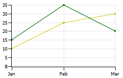
Graph |
|
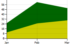
Area chart |
|
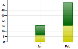
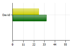
Histogram |
|
Line chart |
|
Pie chart |
|
Chart Building Type
For the "Area chart", "Histogram" and "Line chart" you can specify the method of drawing in the field located to the right of the "Type":
- Accumulation — accumulation charts represent the relation of individual elements (series) to their total amount;
- Normalized — normalized charts represent the percentage of each element (series) in their total amount;
- Layered — layered charts also display ratio of elements (series) to each other. The sequential overlaying of bars of the series is performed here.
Chart Settings
In order to go to the chart setting you should press the "Chart settings" button. The window that contains three tabs will appear as soon as you do it:
Common
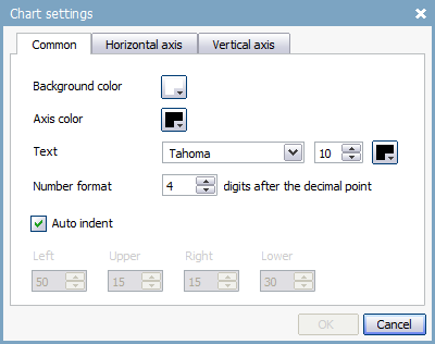
In this tab you can specify different parameters of chart appearance: background color of the chart, color of axes, type, size and color of marks on the axes. You can also specify the numbers format (for fractional numbers) and the indents from the edges of window. If you choose the "Auto indent" option then the indents will be set to defaults and the fields of manual specification of indents will be locked.
Horizontal axis
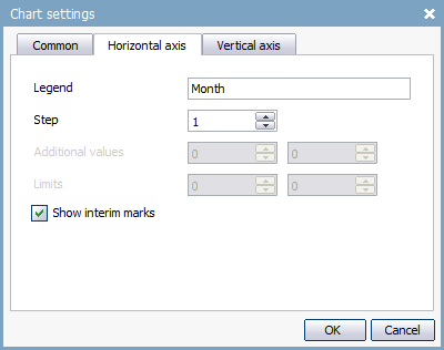
Settings of the horizontal axis can also be called up by a double click with the left mouse button on the horizontal axis of the chart.
In the "Legend" field you can specify the axis name that will be displayed on the chart. The frequency of marks appearance on the axis is specified in the "Step" field. The "1" value means that all marks will be displayed. In the "Additional values" field you can specify the number of additional values on the axis. The values to the beginning of the axis are added through the left field and to the end - through the right one. The boundary values of the axis are specified in the "Limits" field. The lower limit is specified in the left field and the upper is specified in the right one. If you tick the "Show interim marks" field then the vertical lines by each mark will be shown on the chart regardless of the chosen step.
Vertical axis
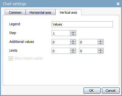
Settings of vertical axis are identical with those of the horizontal one. The exception is when you enable the "Show interim marks" option, horizontal lines will be displayed.
Series Properties
In order to call the window of series properties editing (lines, diagram bars, etc.) you should click with the left mouse button on it. The following window will appear as soon as you do it:
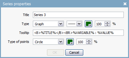
A series has the following properties:
- Title — the name of series. This name can be displayed in a pop-up help that appears if you put the mouse cursor over the series.
- Type — the type of series (graph or histogram), the type of line or bars of the series, their color and transparency in percentage.
- Tooltip — the text of pop-up help that appears if you put the mouse cursor over the series. Here you can use the following macros: %TITLE% - the name of series, %VARIABLE% - the value of the closest point on the horizontal axis, %VALUE% - the value of the closest point on the vertical axis. Tooltip text can be formatted with the following HTML tags:
- <B></B> — makes the covered text bold;
- <I></I> — makes the covered text italic;
- <U></U> — makes the covered text underlined;
- <BR> — inserts the line break;
- <A HREF="link address" TARGET="window for link opening"></A> — presents the covered text as a link;
- <LI></LI> — presents the covered text as a list entry;
- <P ALIGN=""></P> — makes the covered text a paragraph and indicates the alignment;
- <FONT COLOR="" FACE="" SIZE=""></FONT> — set the font color, type and size.
- Type of points — type of points ("Not selected", "Circle", "Square", "Triangle", "Rhombus"), their color and transparency in percentage. The "Not selected" type means that the points will not be shown. This option is available only if the series type is "Graph".
In order to save the chart you should press the  button. Once you did it, you can close the window of chart editor and return to the message editor. A special viewer is used for viewing diagrams.
